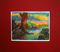
Showing posts with label Other Places Art. Show all posts

21.6.17

Art by Yen

Ta-da!  Introducing my new revamped website: www.artbyyen.com 

Been tardy about blogging since I discover the insta-joy of instagram, and yes, been too busy painting my heart out, no kidding ;p

Okay no more excuses, I am back after six months, oops..  and wonder where I should begin.  My art journey in the past half year has been one of experimentation, not of the wild abandon variety, but trying out new things that I have not had the time to do before, and painting things (even cliche ones!) I have wanted to do at some time but never found the time.  In other words, I was having way too much fun ;p

Revamping my website has given me the chance to contemplate and to draw a thread to it all.. namely, abstraction and more precisely, its no-boundaries anything-goes methods which help me to hone my original style.  I have learnt that the brush and knife are not the only ways to paint, in fact, it is the tool I used least in my recent work. So I veered from abstraction methods of thick layering, sponging, collage, using objects, fingers, you name it, from impressionism to abstraction and back. Including some artwork here that I personally like, whether they came about accidentally or not ;p  After all, abstraction is not knowing where I'd land which is what makes the process so exciting :) My art journey is getting more fun by the day..


Icelandic Houses I, 10"x12"
Starry, 12"x12"
From Prague with Love, 18"x18"
Brilliance, 12"x12"
Cape of Hope, 20"x24"
Sail to the Moon, 18"x18"


Purchase at: yen.artfire.com

18.10.09

Autumn Thoughts Series ( 秋念系列 )

Autumn is a favourite season of mine, perhaps because I don't live in a place with four seasons and don't have to face the prospects of a bleak cold winter ahead with all the bothersome things associated with it. And coming from a country with tropical greens all-year round, the gloriousness of autumn colours never fails to amaze me.
So when I travel, this is usually the season I try to catch - not the hot hot summers where I have had more than enough in my home country, not the cold cold winters even though the sight of snow is exciting to me as well - although spring is a close second preference. But the autumn window is notoriously brief and hard to time, sometimes arriving too early sometimes too late.. but when I did have the privilege to witness the grandeur, it's such a blessing, sigh..
Yet this beautiful transient period is such a provocateur of conflicting emotions - stimulation at the visual treat of nature at its surreal best versus trepidation of what is to come after - so we angst over the beauty, the brevity, the fragility of life, the effluxion of time - even the chinese character for autumn ( 秋 ) with a heart ( 心 ) at the bottom means sorrow ( 愁 ).
When I decided to paint autumn landscapes, this becomes a natural theme for my experiment with expressionism - a season of change, a season that prompts many thoughts - a season for contemplation ( 静禅 ), solitude ( 独思 ) & decisions ( 抉择 ), the titles of my 3 pieces in this Autumn Thoughts series.


Title: Contemplation (O24,SA26)
Description: Autumn is a season of change, with nature seemingly determined to depart from spring with a climax of its most glorious colours before retreating to bitter winter. It is also a period that provokes the most conflicting emotions. Contemplation is the 1st work in my Autumn Thoughts series and exhibited at the inaugural alfresco art fair @ clifford square from 30 Oct~1 Nov 09. 2009.
Medium:
Oil on Ready-to-Hang Canvas.
Dimensions: 45 x 45cm.
Price: SOLD.


Title: Solitude (O25,SA27)
Description: The second work in my Autumn Thoughts series. Aloneness with one's thoughts is the theme of this piece. 2009.
Medium:
Oil on Ready-to-Hang Canvas.
Dimensions: 60 x 45cm.


Title: Decisions (O26,SA28)
Description: Autumn Thoughts series. The inevitable need to find meaning and resolution in our thoughts is the central theme behind this piece. 2009.Medium:
Oil on Ready-to-Hang Canvas.
Dimensions: 60 x 45cm.

Price: SOLD.


7 comments:
anna jasmin said...
This painting (Contemplation) attracts, and I am happy it does. It possess a certain awe. Love looking at it!
jeffrey said...
I like the lighter shades in Solitude - kind of resonates with the theme how the colours of life start fading away when autumn beckons, don't you think? =)
beibei said...
like Contemplation and Decisions. Stronger Autumn Colors for me. I love Autumn too..那多事的秋。
jiayi said...
I like Solitude as well. 喜欢比较细腻的画作。
allison said...
Beautiful painting (Contemplation miniwork) (I just got it framed and hung and love it) and a great seller. Thank you!
janet said...
Just wanted to let you know that I received your painting (Solitude miniwork) yesterday.. Safe and sound, I love it!!

melissa forcier said...
Really beautiful!! (Contemplation painting)

6.9.09

Cathedral Mountain


This is the 2nd piece on Cathedral Mountain. And no, it's not Ayers Rock which many people thought it was. The pic was taken after another long wet day on the 60-kilometre Overland Track from Cradle Mountain to Lake St Clair in Tasmania when we reached our hut and lo and behold, the mountain was right before us in all its glory and made the day's tough trip all well and worth it :)

Whereas Tree And Cathedral Mountain (post below) carries a degree of foreboding as we were journeying on, this one evokes a sense of renewed exuberance. And it is hoped that the same goes for my artistic journey, with twists and turns not knowing what the future may hold but with rewards of joy along the way to spur me on :)


Title: Cathedral Mountain (O22,SA25)
Description: Behold the Cathedral Mountain, Overland Track, Tasmania. 2009.

Medium: Oil on Ready-to-Hang Canvas.
Dimensions: 50 x 40cm.


1 comment:
ping said...
does look like Ayers Rock...

Tree And Cathedral Mountain

After using painting knife for a long spate, I suddenly missed my brushes and decided to try a new approach using short vertical strokes and simplifying the objects in the scene. In a sense, I was gravitating towards the abstract. I was never a realist anyway and more of an impressionist but I needed to establish an identity. Many have said that my colours are distinctive but something more is needed.

Flipping through my photos, I came across 2 pictures from my hiking trip in Tasmania on the Overland Track (some say Underwater Track) that gave me strong indescribable feelings. They both have this imposing mountain aptly called Cathedral Mountain, the 1st in the distance taken when we were hiking towards it, and the 2nd captured when we've reached our hut that has the mountain as a magnificient backdrop.

I did both paintings at the same time and they therefore have a common colour palette. They are an experiment and different from my past works. But I do think that they convey the feelings that the pics and my remembrance of the trek gave to me.


Title: Tree And Cathedral Mountain (O21,SA24)
Description: On the Overland Track in Tasmania with Cathedral Mountain in the distance. 2009.
Medium: Oil on Ready-to-Hang Canvas.
Dimensions: 50 x 40cm.

19.7.09

Approaching Storm I

To round off my cloud-themed series, I decided to do 2 works simultaneously that involved clouds in the backdrop. As it turned out, both reference pics I chose happened to have mountains.

The 1st is an opportune shot I took while descending on the plane to Capetown at the southern tip of South Africa. It shows the city's omnipresent Table Mountain which seemed to carry a beacon of hope at the top amidst a gathering storm over the sprawling city. Capetown is an exquisitely beautiful, sparkling city - exotic, colourful, exciting, even dangerous, full of contraditions, and somehow the wilderness is always nearby in Africa..

Suffice to say, my trip was a memorable one by all accounts. And somehow, the vibes of the place came through when I did the painting. My colours got stronger and stronger and I ended up with a colourfully drama piece which hopefully captures the unique essence of the place. This work will be displayed at the 6 perspectEVEs exhibition on 4 ~ 28 August 2009 at The Art Loft @ Volvo.


Title: Approaching Storm I (O18,SA9)
Description: Hope amidst an approaching storm at Capetown's Table Mountain. 2009.

Medium: Oil on Ready-to-Hang Canvas.
Dimensions: 60 x 45cm.
Price: SOLD.


1 comment:
tt said...
Like the picture "The approaching storm 1". Good effort.

17.7.09

Cloud Series ~ The Log


My 1st series!!! Well, at least I'm calling it so - zee Cloud Series. I've written about how this piece came about before (see current work post) so I will not repeat.

The reference pic was taken at my 2nd backpacking trip, and one of my best trips, to the Canadian Rockies which seemed like eons ago now. I was trudging around Tunnel Mountain at the Banff National Park in dramatic conditions (i.e. trying desperately not to be blown off) when I came across this fallen tree log and was dumbfounded by the scene, with the golden brush rustling against it up into the horizon where ominous clouds gather above the hint of the Voodoos glacial mountains in the distance. I had a wonderful adventure at the Rockies with stunning scenery aplenty but in terms of intensity, this pic best captures the tintillating wilderness of the elements of mother nature in this beautiful region. And it was with this intensity in mind that I laid the thick knife strokes and bold colours.

I'm proud to announce that this painting will be shown at the 6 perspectEVEs exhibition on 4 ~ 28 August 2009 at The Art Loft @ Volvo.


Title: Cloud Series ~ The Log (O15,SA6)
Description: Capturing the dramatic tension between the elements at the Canadian Rockies. 2008.
Medium:
Oil on Ready-to-Hang Canvas.
Dimensions: 50 x 40cm.


1 comment:
jeffrey said...
"The Log" is captivating!

8.7.09

Mornington Peninsula ~ Simon's Vintage Stuff


Finally, I had to do a painting on the wonderful collectibles of our host - photographer-cum-vintage collector-cum many other interests - one Simon Wong's house in Dromana on the Mornington Peninsula, which is incidentally an area with plentiful flea markets and op-shops (viz charity antique shops). Many an evening we spent listening to his oldies vinyl records, like this Beatles one, on his antique gramophone going round and round..

This nice cream-coloured table was by the window and one afternoon, the sun rays came beautifully through the blinds creating an intricate lace pattern on Simon's "gu dong" stuff. Naturally all of us present couldn't resist whipping our cameras or mobiles to capture the effect.

I started with a sketch where the colours worked pretty well, even though they are quite different from the original scene. Then I moved on to a canvas experimenting with my new found painting knife method which is especially good on glass objects. It's a pleasant painting to do and brings back nice memories of our stay at Simon's house where time seemed to stand still and we relaxed and had endless chats without modernities like the TV in the way of what living should be about. Haha.. since that memorable trip, the vintage habit has rubbed on at least 2 of the group.. luckily I got restraint as it is a rather expensive hobby to have in Singapore!
Title: Mornington Peninsula ~ Simon's Vintage Stuff (O14, SA5)
Description: A charming table of vintage stuff at the house of photographer Simon Wong in Dromana, Mornington Peninsula. 2008.

Medium: Oil on Ready-to-Hang Canvas.
Dimensions: 60 x 50cm. SOLD.

Mini-Acrylic Work (with red cardboard frame) 24x21cm: SOLD.

Mornington Peninsula ~ Tea At Boathouse


Besides outdoors, the
Mornington Peninsula area also has charming restaurants. This particular one called Boathouse is beside an art gallery and we spent a leisurely afternoon having long discourses over tea and cakes in the al fresco sitting at the back which is beside a river and has lovely greenery filtering the sun rays much like a Monet painting.

The soft yellowish-green lighting of the scene from my reference photo is what I started with as the main toning for the painting. However, as I started to do the table cloth and objects, I started getting adventurous on the colours. The table is tilted up for better composition and perspective. The end result is I think a quaint painting, just like the restaurant ;p


Title: Tea At Boathouse (O13)
Description: Tea table at a quaint monet-like restaurant called Boathouse, Mornington Peninsula. 2008.

Medium: Oil on Ready-to-Hang Canvas.
Dimensions: 50 x 40cm. SOLD.

Mini-Acrylic Work (with lime green cardboard frame) 26x21cm: SOLD.


3 comments:mary c. aikens said...
I really like your paintings very much. You have captured the use of color... The "Street Scene in Arles" and "Tea At Boathouse" are among two of my favorites of your paintings..
beibei said...
Peace and serenity
weishian said...
I especially like the Clouds – Dome and the Mornington Peninsula – Tea at Boathouse.


5.7.09

Mornington Peninsula ~ London Bridge

The trip to the Mornington Peninsula has got to be my most productive art trip ever because I continued to paint it long after getting home to Singapore, testament indeed to the wonderful lighting and strong colours of the place, the feelings it invokes and why it is a popular artist enclave.

I started this oil piece using brush and ended up with painting knife instead and this marked the start of several knife pieces. The setting is a dramatic arched rock shaped like a bridge, hence the namesake of the iconic bridge. While the view was stunning when we visited the coast, it was incredibly hot and well impossible to paint without fainting so we did the next best thing and took pictures ;p

First I did a sketch on acrylic paper in a tilted position like my photo which turned out well and then progressed to canvas. With the larger space, I wanted to do more to elicit the feeling of strong bright colours that the scene gave me, which I wasn't quite able to achieve until I started experimenting with the painting knife. There was no turning back after that.


Title: Mornington Peninsula ~ London Bridge (O12,SA3)
Description: My tilted impression of the dramatic London Bridge rock formation at the Mornington Peninsula. 2008.
Medium:
Oil on Ready-to-Hang Canvas.
Dimensions: 60 x 50cm. SOLD.
Mini-Acrylic Work (with dark green cardboard frame) 27x21cm: SOLD


1 comment:
alice said...
I really like this one...


Mornington Peninsula Art Trip ~ Sorrento Portsea Artists Trail

To complete the trilogy of 'decent' plein air works from the memorable art trip down under, this one was done at a secret secret place by virtue of the fact that we had a tip from a local artist and still took a few wrong turnings before finding this wonderful trail.

As the work title goes, it is a historic artist trail which has become a millionaires walk no kidding ;p After checking out the millionaires' mansions, no really, the path itself for a good spot to paint, we decided to go back to the beginning of the trail which has ample space and a few
viewpoints of the distinctive boathouses on the coast. It was a very hot day so the challenge was more to complete before we melted ;p

I love the pattern woven by the bridges to the boathouses and how they interweave with the lovely patterns of seabed and different hues of the bay waters. I used a portrait view to exaggerate this pattern and had fun creating the sense of perspectives from multiple colours and dulling them with the distance. Initially I included the cliff fence at the bottom but removed it later back home because it distracts from the composition.

Title: Mornington Peninsula ~ Sorrento Portsea Artists Trail (A8)
Description: Plein air work at Australia's Mornington Peninsula. 2008.
Medium:
Acrylic on Panel (flat).
Dimensions: 40 x 30cm.
Price: SOLD.

1 comment:carol pino said...
I really like the Sorrento's Portsea Artists' Trail Monrnington Peninsula, Victoria... I love your bold yet nuanced approach to color.

2.7.09

Mornington Peninsula Art Trip ~ Cape Schanck


My 2nd favourite piece from the art trip is this "Budha Palm" rock at Cape Schanck which just screams to be painted. Okay I'm exaggerating. But this unusual rock formation which we had to lug our stuff all the way down an eternal flight of wooden bridge steps to reach did give us all The Feeling, so to speak, to start work immediately.

Not that we had a choice given the challenging conditions. Dramatic setting means spectacular wave sprays and winds, not to mention flying pebbles and worst of all, the sandflies and awful bites! My acrylic paint seemed to dry as soon as I squeezed them out and I actually wore sun-glasses (to the amusement of my fellow artists) to keep out the sand blizzards. It was no wonder that my initial work ended up a tad "overly wild" for the skies and I had to tone it down subsequently back home. But I do like the rock piece effect. And this is a good companion piece to my Mornington Pier work (below) which I have hanging together in my bedroom :)


Title: Mornington Peninsula ~ Cape Schanck (A7)

Description: Plein air work at Australia's Mornington Peninsula. 2008.
Medium: Acrylic on Ready-to-Hang Canvas.
Dimensions: 30 x 25cm.
SOLD.


1 comment:
sarah said...
This painting is truly beautiful. My friend is Australian and misses home from time to time...it's his 50th birthday..i know he will love this gift. Thank you!

Mornington Peninsula Art Trip ~ Mornington Pier

I've written about this amazingly fun art trip down under before so I'd concentrate on the artworks, starting with one of my favourites which somehow everything clicked just nicely for this plein air piece.

It was late morning when we arrived at Mornington Pier and the sight of the many boats and yachts bobbing along on the soft turquoise waters just gave me a very pleasing feeling. I especially like one particular wooden-planked navy blue tented boat so I decided to use it to anchor my composition. At the time I was reading up a lot on Cezanne and it just came naturally that I should tilt the front boats up for better compositional shapes never mind the distortion in perspective. I also consciously shortened the length of the masks to create depth of the boats but exaggerated the one on the front right yacht for a strong vertical to balance the horizontal components. Everything worked well enough and the pastel colours just came naturally to match the boat that I liked and started with, so the only challenge was to get it all done before our stomachs came a-growling for lunch time ;p


Title: Mornington Peninsula ~ Mornington Pier (A6)

Description: Plein air work at Australia's Mornington Peninsula. 2008.
Medium: Acrylic on Ready-to-Hang Canvas.
Dimensions: 30 x 25cm.
SOLD.


Prints available for purchase at my artfire shop.


1 comment:
fauziah said...I love the mornington pier it looks so alive..

21.4.09

Seasons ~ Autumn Crescendo


The reference photo for this piece was taken on the famous 100-mile Klondike Highway from Skagway, Alaska to Whitehorse, Yukon Territory, paralleling the White Pass Trail of the 1897-98 Klondike Gold Rush. I love this shot because it shows the winding road flanked by tumbling autumn slopes with majestic snow-laden mountains interpersed in clouds looming ahead. Everything folds into a kaleidoscopic centre where the highway appears to dip into a lake, hinting at the drama and spectacle that lays ahead.

I did the watercolour piece at a time when I was experimenting with watercolours, which I learned to be an unforgiving medium when it came to mistakes. However, I was really pleased with the nuanced effects I could achieve for the clouds interplay with the mountains. Later when I moved back to oil and started using painting knife, I decided to try this piece in a different mood. I had been trying to learn colour theory from artbooks which somehow stifled my inspiration, so this piece was a happy comeback explosion of sorts for my colourful palette. In the end, I have 2 works on the same scene but varying in medium and moods - one bold and glorious, the other subdued and pensive - echoing respectively the sweeping events of the grand epic adventure that was the Klondike Gold Rush and the poignant poetic side of the individual human stories.

The oil piece will be displayed at the 6 perspectEVEs exhibition from 17 ~ 28 August 2009 at The Art Loft @ Volvo.


Title: Seasons ~ Autumn Crescendo (O8)
Description: On the Klondike Highway from Alaska to Yukon. 2008.
Medium: Oil on Ready-to-Hang Canvas.
Dimensions: 73 x 60cm.
Price: SOLD.
Watercolour Autumn Highway (W1) 41x32cm: S$80 (USD62).


2 comments:
alice said...This is gorgeous!
judy said...
Your use of color adds excitement to your work! I love your treatment of the mountain scape in Autumn Crescendo and the lovely Winter Wonderland.

2.4.09

Leisure ~ Street View Through Stained Glass


The reference photo (below) for this work was taken during my solo journey through Egypt, a particularly eventful and unforgettable one even as backpacking trips go. I had started my adventure from sunny Aswan, the southern end of the Nile, and slowly made my way up to the chilly north, arriving at long last to chaotic Cairo. After all the desert and sands and ruins, it was really disorienting coming back to civilisation, and an ecclectic one at that, not to mention constantly trying to avoid being run down by the mad honking traffic. So it was with relief when I found this nice peaceful cafe for a tea break. My seat was beside a lovely tainted window overlooking a busy market street which finally allowed me to enjoy and appreciate the energetic buzz and charms of Cairo from a "safe" distance ;p

The painting reflects my relieved restful and relaxed mood at the time and the european feel that Cairo gave to me. I maintained the colour scheme and shapes of the original window panels but took liberty with the buildings, vehicles and passer-bys on the street according to the mood I wanted to convey ~ that of observing in contemplation a bustling street with everyday life going-ons on a lazy leisurely afternoon with the colourful panels offering different pictures, perspectives and moods of the scene, much like a reflection of the trials and tribulations in life.


Title: Leisure ~ Street View Through Stained Glass (O4)
Description: Inspired by a window scene from a cafe in Cairo, Egypt. 2007.
Medium: Oil on Ready-to-Hang Canvas.
Dimensions: 60 x 50cm.
SOLD.

3 comments:

alice said...
Cool!
gerry said...
Starry Night and the stained glass oil painting are my favorite.
weishian said...
Leisure ~ Street View Through Stained Glass piece was pretty unique..

20.3.09

Seascapes ~ Destiny


This work marks my foray into using oil instead of acrylic to do landscape. It was really exciting as the medium offers so much flexibility and possibility even at the sketch stage. The vividness of the colours stay better unlike acrylic which tends to dull a bit after a week. And of course, oil is removable (in most cases anyway) which makes experimenting and changes easy and is the reason why people say it's the easiest medium for art. Of course, it's not without its minuses, like the smell and having to wait for it to dry relatively before moving to the next stage to avoid muddiness.

With this and the teacher's encouragement to go thick, I "took the plunge" literally and applied really thick (by my standard then) slabs of oil and go with my natural instinct for colours for this scene from my South NZ trip where I had taken a whale-watching trip off Kaikoura. It was a wonderful ride and the photo captured a magic moment when we chanced upon a resident fishing boat that attracted a lot of seabirds including huge albatrosses. I love the photo and hope to capture the spirit and romanticism that this scene conveyed to me - that of a lone boat staying afloat on rocky waters yet optimistically rolling along with the rhythm of the waves towards its destination flanked by birds that seem to aid it on its journey.


Title: Seascapes ~ Destiny (O1)
Description: One of my first oils, a depiction of the joyful sense of purpose this scene of a boat in choppy waters off Kaikoura, South NZ, gave to me. 2005.
Medium: Oil on Ready-to-Hang Canvas.
Dimensions: 50 x 40cm.


18.3.09

Glacier Valley At Franz Josef

This was one of my first landscape pieces after joining my art space, where I learned spatial (near-far) perspective and optical mixing, an impressionist technique that involves say putting 2 colours beside each other instead of mixing the pigments so that the intensity is retained. Except in my case I went riotous with the colours. It was great fun doing this piece :)

The reference photo (below), a shot from my trip in South NZ, looks quite different but it had evoked in me a sense of mystery and fantasy which invited me to run free with my imagination, at least colour-wise.


Title: Glacier Valley At Franz Josef (A1)Description: Evoking a sense of mystery and fantasy to this glacier valley scene at Franz Josef, South NZ. 2005.
Medium:
Acrylic on Ready-to-Hang Canvas.
Dimensions: 46 x 33cm.
Price: SOLD.


1 comment:
weishian said...
Glacier Valley At Franz Josef has a pretty modern touch, to me that is.